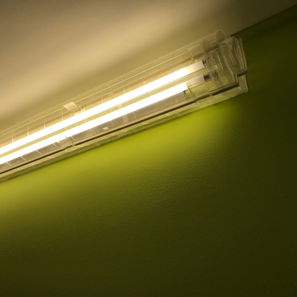
Light is more than illumination; it is an emotional language, a scientific phenomenon, a design tool, and a fundamental part of how humans interpret the world. At the heart of this entire relationship lies color temperature, a concept that shapes everything from the ambience of a room to the psychological cues our brain receives. Truly, understanding color temperature unveils the mysterious veil of the world of light and color, allowing us to decode the subtle, invisible forces that guide perception, mood, and visual harmony.
This comprehensive guide reveals what color temperature is, how it works, why it matters, where it is applied, and how it transforms both natural and artificial lighting environments. Whether you’re a lighting designer, photographer, engineer, or simply someone curious about how light influences daily life, this article pulls back the veil on one of the most intriguing parameters in lighting science.
What Is Color Temperature? A Scientific Yet Aesthetic Concept

Color temperature is a numerical representation of the color characteristics of light, expressed in degrees Kelvin (K). It describes whether a light source appears “warm,” “neutral,” or “cool.”
Here is the foundational idea:
- Lower color temperatures (1800K–3000K) look warm, producing yellow, amber, and orange tones.
- Mid-range temperatures (3500K–4500K) appear neutral, balancing warmth and coolness.
- Higher temperatures (5000K–6500K and above) look cool, producing white to bluish-white light.
Color temperature is based on the concept of a blackbody radiator — an idealized object that emits light with a predictable spectrum as it heats up. As its temperature increases, its color shifts from red to yellow to white to blue.
This principle led to the Kelvin scale for describing light color, which now underpins nearly every lighting standard used in engineering, interior design, photography, cinematography, and display technology.
Why Color Temperature Matters: The Invisible Force That Shapes Experience
Color temperature is so essential because it affects:
- human emotion
- visual comfort
- biological rhythms
- aesthetic perception
- productivity and focus
This is why designers, architects, photographers, and lighting engineers rely on precise color temperature values to achieve desired outcomes.
Understanding color temperature, unveiling the mysterious veil of the world of light and color, opens an entire dimension of creative and scientific control over visual experience.
The Kelvin Scale Explained
The Kelvin scale is absolute, starting at 0 K (−273.15°C). For lighting purposes, the key regions include:
1. Candlelight (1500K–1900K)
Extremely warm, amber-rich, soothing, and intimate. Often used in hospitality spaces, romantic environments, and vintage lighting.
2. Incandescent Warm Light (2400K–2700K)
Classic household bulb appearance. Relaxing, cozy, ideal for living rooms and bedrooms.
3. Warm White (3000K)
More neutral but still warm. Popular in modern interiors, hotels, and decorative lighting.
4. Neutral White (3500K–4100K)
Balances warm and cool tones. Preferred in offices, kitchens, and commercial spaces.
5. Daylight White (5000K–5500K)
Bright and crisp. Ideal for task lighting, workshops, labs, and areas requiring clarity.
6. Cool Daylight (6000K–6500K)
High clarity and energetic. Used in industrial settings, photography, and outdoor lighting.
7. Ultra Cool Light (>6500K)
Bluish tones are often associated with overcast daylight. Used in certain specialized applications.
How the Human Brain Interprets Color Temperature
Color temperature profoundly affects human psychology:
- Warm light induces relaxation, comfort, and calm.
- Neutral light supports clarity, attentiveness, and balance.
- Cool light enhances alertness, focus, and mental stimulation.
Our brains evolved under the natural cycle of daylight — sunrise, noon, and sunset — which explains why lighting color influences circadian rhythms. Warm evening light signals the body to wind down, while cool midday light increases alertness.
Thus, color temperature is not merely a technical measurement; it is part of our biological and emotional framework.
The Relationship Between Light and Mood
Lighting psychologists and design specialists highlight the following effects:
Warm Light (2500K–3000K)
- Reduces stress
- Creates intimacy
- Evokes comfort and softness
- Preferred for hospitality and homes
Neutral Light (3500K–4000K)
- Enhances realism
- Minimizes color distortion
- Ideal for high-accuracy tasks
Cool Light (5000K+)
- Increases concentration
- Promotes productivity
- Enhances visual acuity
- Used in offices, hospitals, and classrooms
Understanding these associations helps designers craft environments that better support human well-being.
Color Temperature and Spectral Power Distribution (SPD)
Color temperature is not the same as the full spectrum of light, but it correlates with the spectral power distribution (SPD). Different sources with identical Kelvin values may look slightly different depending on how their wavelengths are distributed.
This is why:
- A 3000K LED
- A 3000K incandescent lamp
- A 3000K halogen bulb
can all appear subtly different.
SPD also affects:
- color rendering
- visual comfort
- glare
- brightness perception
Thus, color temperature must be considered alongside other photometric metrics for accurate lighting design.
Correlated Color Temperature (CCT): The Modern Standard
Real-world light sources rarely behave like perfect blackbody radiators. To describe them, engineers use Correlated Color Temperature (CCT) — a practical adaptation of the Kelvin concept.
CCT provides a standardized way to categorize:
- LED lighting
- compact fluorescent lamps
- digital displays
- photography lighting
For designers and technicians, CCT ensures clarity when comparing products.
Applications of Color Temperature Across Industries
Color temperature is a universal concept used across dozens of fields. Here are the most important applications.
1. Interior and Architectural Lighting
Architects rely on color temperature to:
- create ambiance
- highlight textures
- evoke emotions
- guide the human experience of a space
Warm light makes interiors feel intimate, while cool light creates energy and modernity.
2. Photography and Cinematography
Color temperature is critical in:
- white balance settings
- scene mood creation
- accurate reproduction of skin tones
- simulating natural daylight
Filmmakers manipulate color temperature to influence emotional tone.
3. Retail and Commercial Lighting
Stores use precise CCT values to:
- make products appear more attractive
- influence purchasing behavior
- control brand identity
Warm temperatures are common in luxury retail, while cool temperatures are used in high-tech stores.
4. Industrial and Office Lighting
Workspaces often require higher CCT to improve visibility and productivity. Correct color temperature enhances:
- task performance
- safety
- visual clarity
5. Healthcare Environments
Hospitals use specific color temperature systems to:
- promote healing
- reduce stress
- enhance clinical performance
- support patient circadian rhythms
Cool-white light is essential in surgical and diagnostic applications.
6. Automotive Lighting
Headlights and interior lighting rely on color temperature to ensure:
- visibility
- safety
- aesthetic appeal
Cooler temperatures improve night-time detection.
7. Smart Lighting and IoT Systems
Modern lighting systems allow dynamic color temperature tuning:
- cool light in the morning
- neutral light during the day
- warm light in the evening
This supports circadian health and enhances comfort.
How to Choose the Right Color Temperature for Any Space
Here is a simple guide:
Homes
- Bedrooms: 2700K–3000K
- Living spaces: 2700K–3000K
- Kitchens: 3000K–4000K
- Bathrooms: 3500K–4500K
Commercial
- Offices: 4000K–5000K
- Retail: 3000K–4000K based on brand
- Supermarkets: 3500K–4500K
Industrial
- Warehouses: 5000K–6500K
- Factories: 5000K–6500K
Hospitality
- Restaurants: 2200K–2700K
- Hotels: 2400K–3000K
Color temperature becomes a design language that tailors experiences.
Color Temperature vs. Other Lighting Metrics
CCT vs. CRI
- CCT = color appearance
- CRI = color accuracy
CCT vs. Chromaticity
- CCT is one-dimensional
- Chromaticity is two-dimensional (x,y coordinates)
CCT vs. Luminous Flux
- CCT = light color
- Flux = perceived brightness
The Future of Color Temperature Technology
Lighting is increasingly dynamic and human-centric. The newest trends include:
1. Tunable White Lighting
Allows seamless transitions from warm to cool temperatures.
2. Spectrally Enhanced Lighting
Uses optimized wavelengths to increase perceived brightness without increasing power.
3. Circadian Lighting Systems
Mimic natural sunlight cycles to improve sleep, productivity, and well-being.
4. AI-Driven Lighting Controls
Use sensors and contextual inputs to adjust color temperature automatically.
As these technologies evolve, color temperature, unveiling the mysterious veil of the world of light and color, remains a core foundation.
Conclusion: Lifting the Veil on the Science and Magic of Color Temperature
Color temperature is more than a measurement; it is the key that unlocks a deeper understanding of how humans experience light. By mastering color temperature, we uncover the hidden relationships between science, psychology, design, and emotion. Whether tuning LEDs in a smart home, capturing beauty through a camera lens, or designing the lighting for a commercial space, color temperature becomes a transformative instrument — one that shapes environment, mood, and perception.
Indeed, the deeper we explore color temperature, unveiling the mysterious veil of the world of light and color, the more we realize how profoundly light influences life.


